Close

Let's Create Next Big Thing

Thank you! Your submission has been received!
Oops! Something went wrong while submitting the form.
Evolutio
UX Case Study

A Journey to Empower Learners in Nigeria

Descritpion:
This case study focuses on revamping Evolutio’s app by enhancing the visual design, making buttons more prominent, exploring gamification options. The goal was to create a more intuitive, engaging, and visually appealing user experience.
Date:
Feb, 2024
Service:
UX Case Study

Designing for Dyslexia: Creating an Inclusive Learning Platform in Nigeria

The Dyslexia Foundation Nigeria is a nonprofit organization working to raise awareness, offer early screenings, and provide support for children with dyslexia across Nigeria. Through a partnership with Tech Fleet, I joined a cross-functional team during Phase 3 of a multi-phase initiative to design a digital learning platform tailored to neurodiverse learners. Our mission: to empower students with dyslexia through accessible learning tools, while equipping teachers and parents with the resources to support their progress — all in a country where access to dyslexia diagnosis and support remains limited.

Key Challenges I Faced

How might we create a digital learning environment that supports students with dyslexia, while empowering teachers and parents to track and guide progress — all within a fragmented system?

When I joined the Phase 3 team for the Dyslexia Foundation of Nigeria through Tech Fleet, the project had already gone through two development cycles. But instead of building on a strong foundation, we inherited scattered research, incomplete design files, and little knowledge transfer. Many of the contributors from earlier phases didn’t transition into Phase 3, leaving us with unclear user needs and a fragmented vision.

Meanwhile, our users — students with dyslexia, their teachers, and their parents — still lacked a cohesive digital space to learn, teach, and support one another. We were tasked with helping bring this vision to life. 

Scattered Knowledge Transfer:
The handoff between phases was inconsistent, with most past insights and decisions undocumented or outdated. I took initiative to synthesize research from previous phases, clarify user goals, and work closely with teammates to rebuild a shared understanding of what we were solving for.

Design Inconsistencies Across Teams: The platform was split between two teams — UXDA (student experience) and UXDTB (teacher experience). Working separately meant our design kits diverged significantly, and this issue didn’t come to light until just before a stakeholder meeting. With guidance from Tech Fleet leadership, we quickly aligned visual systems, reworked components, and ensured a consistent experience across both sides of the platform. 

Limited Access to Users:
Direct research with students and teachers in Nigeria wasn’t possible at this phase. Instead, our research team focused on secondary research, diving deep into the challenges of dyslexia, inclusive learning practices, and accessibility design. This helped us make informed decisions while designing for empathy, simplicity, and support.

Cross-Departmental Coordination: With dedicated research, content, and development teams working asynchronously, I learned to navigate complex team dynamics, proactively communicate across departments, and keep our work on track.

Project Goals

Empower Dyslexic Students
Provide structured, accessible, and engaging learning materials designed to support the unique needs of students with dyslexia.

Support Teacher Workflows
Design tools that help educators track student literacy development, assess learning progress, and adjust instruction effectively.

Engage and Educate Parents
Offer resources and guidance to help parents better understand dyslexia and actively support their child’s educational journey.

Promote Awareness Across Nigeria
Create a unified, inclusive web presence to raise awareness, reduce stigma, and expand access to dyslexia screenings and support.

Lay the Groundwork for Phase 4
Organize and streamline scattered program data to enable future development of features like screening tools, adaptive content delivery, and a parent-facing mobile app — ensuring long-term scalability and impact.

My Role


As the sole UX Designer on this project, I took initiative in an ambiguous, multi-phase environment to craft a user-centered experience for students, teachers, and parents. My contributions included:

Synthesizing legacy research
Reviewed and distilled earlier phase materials to surface relevant insights and align design with user needs.

Mapping multi-user journeys
Outlined end-to-end journeys for students, teachers, and parents to uncover shared frustrations and distinct objectives.

Restructuring platform architecture
Redesigned site navigation to reduce friction, improve accessibility, and streamline content discovery.

Designing for real-world impact
Built low- to high-fidelity wireframes for:
Teacher dashboards to track literacy growth
Student modules designed for dyslexic readers
Parent resources that educate and empowerThrough every step, I kept inclusivity, clarity, and long-term scalability at the core of the design process.

Key Insight

Fragmented research hurts users: Without a central source of truth, earlier design decisions lacked alignment. I helped unify the vision so we could build something coherent and user-first.

One-size doesn’t fit all: Each user group (student, teacher, parent) had unique needs. Designing role-based experiences was essential to avoid overwhelming or confusing anyone.

Accessibility isn’t a feature — it’s the foundation: From color contrast to font selection and navigation hierarchy, every decision was guided by neurodiverse accessibility.
Outcome

We delivered a scalable design system and platform prototype to hand off for development in future phases. Though the platform hasn’t launched publicly yet, our work laid the foundation for an experience that is inclusive, educational, and empowering.

This project taught me how to bring order to chaos — turning a tangle of information into something simple, helpful, and human-centered.
Learnings

Working on this project challenged me to lead with empathy, clarity, and structure — especially in a multi-phase, evolving environment. Here's what I took away:

Clarity unlocks momentum
Diving into scattered files and past work taught me the value of organizing chaos into actionable insights — fast.

Designing for accessibility is a mindset, not a checklist
Creating experiences for dyslexic learners deepened my understanding of inclusive design and pushed me to rethink everything from layout to microcopy.

Cross-role journeys require balanced solutions
Designing for students, parents, and teachers at once required constant trade-offs — and taught me how to prioritize user needs across the ecosystem.

Documentation is design, too
Documenting decisions, rationales, and flows became critical in aligning with stakeholders and ensuring continuity across phases.This experience sharpened not only my design thinking but also my ability to lead through ambiguity — a skill I now carry forward into every new project.

Welcome to Well Track.  Join us as we explore how our fitness app brings friends and family closer through shared workouts, messages, and posts. Discover how easy it is to stay motivated and connected, transforming your fitness journey into a fun and supportive experience. Let’s dive into our case study, showcasing how Well Track can make exercising a shared adventure without any hassle.

The Problem

A well established company’s health tracking app, launched three years ago, currently enables users to monitor their health and fitness progress within a family or friend group. Despite its initial popularity, user engagement significantly drops after three weeks, leading to frequent app deletions. Currently, the app lacks a messaging feature, hindering users from communicating their fitness goals and achievements. To address this issue, the challenge is to design a feature that enhances user interaction and motivation, aligns with the app’s existing functionalities, and reflects the company’s contemporary, trustworthy, and motivational brand personality. The solution should also cater to the needs of tech savvy, budget conscious users who prioritize communication with their social circles.

The Solution

A well established company’s health tracking app, launched three years ago, currently enables users to monitor their health and fitness progress within a family or friend group. Despite its initial popularity, user engagement significantly drops after three weeks, leading to frequent app deletions. Currently, the app lacks a messaging feature, hindering users from communicating their fitness goals and achievements. To address this issue, the challenge is to design a feature that enhances user interaction and motivation, aligns with the app’s existing functionalities, and reflects the company’s contemporary, trustworthy, and motivational brand personality. The solution should also cater to the needs of tech savvy, budget conscious users who prioritize communication with their social circles.

My Role as a Designers

  1. Designing the App Interface: Crafting a user friendly and visually appealing interface that seamlessly integrates new messaging features and enhances overall user experience.
  2. Developing Interaction Features: Creating and implementing the Feed, Direct Messages, and Stories sections to foster engagement and communication among users.
  3. Conducting Usability Testing: Evaluating the new features through usability testing to ensure they meet user needs, drive engagement, and align with the app’s brand personality.

Process Overview

Step 1

To begin addressing the challenge, I studied other successful apps in the fitness and wellness market to understand their strengths and weaknesses. I analyzed three popular apps: Productive Habit Tracker, Fitlist , Gym Workout Log, and Nike Run Club.

Findings:

Productive Habit Tracker

  1. Highly interactive due to its variety of challenges and thoughtful design elements, like the Promise to complete signature.
  2. Keeps users motivated with daily prompts.

  3. However, it lacks messaging features, and its dark UI feels congested, which can hinder longterm engagement.

Nike Run Club

  1. Offers strong group workout capabilities, a comprehensive activity tracking system.
  2. Achievement badges.
  3. Despite these strengths, it lacks direct messaging and has a rather blank landing page.

Fitlist

  1. Excels in practical functionality and detailed workout logging.
  2. Providing users with a progress dashboard and group workout features.

  3. However, its dull UI and lack of direct messaging limit user engagement.

Step 2:

Creating a Name for the App, Visual and UI Style

To begin addressing the challenge, I studied other successful apps in the fitness and wellness market to understand their strengths and weaknesses. I analyzed three popular apps: Productive Habit Tracker, Fitlist , Gym Workout Log, and Nike Run Club.

Step 3:

Creating a Project Plan with Deadlines and Submission Details

To ensure a structured and timely development process, I created a comprehensive project plan outlining key milestones, deadlines, and deliverables for each stage of the app design and implementation.

Creating a Research Plan

To gather the necessary insights for designing effectively, a comprehensive research plan was developed. The main interview questions of the research plan are as follows:

  • How do users currently interact with health and fitness tracking apps?
  • What motivates users to engage with health and fitness apps regularly?
  • How can messaging features be integrated into the app to enhance user engagement and retention?
  • What types of messages e.g., goal achievements, motivational messages are most likely to encourage sustained usage?
  • How do users prefer to receive notifications and messages within a health and fitness app?
  • What are the potential challenges users might face with the new messaging feature?

Step 5:

Research Insights

Understanding How Users Interact and Stay Motivated:

  • How do users currently interact with health and fitness tracking apps?Users track various health aspects: daily steps, workouts, sleep patterns, running routes, cycling routes, food intake, hydration levels.
  • Motivations include:
    • Seeing progress and reaching personal goals.
    • Being part of a community and participating in challenges.
    • Earning badges and achievements.
    • Receiving personalized feedback and suggestions.

User Preferences for Messaging Features:

  • Prefer messages that recognize achievements and provide motivation.
  • Valued message types:
    • Goal achievement messages.
    • Motivational quotes and wellness tips.
    • Reminders to log activities and personalized tips.

Step 6: Creating User Flows

1. Messaging Friends or Family Post Workout:

  • This flow outlines the process for users to send motivational messages to friends or family after completing a workout.

2. Engaging in Community:

  • This flow illustrates how users interact with community features, such as joining challenges, participating in discussions, and tracking progress.

Low Fidelity designs

Findings:

Confusion Between Activity and My Progress:

  • Users were unclear about the distinction between the Activity and My Progress sections. They found it difficult to understand what content or features were unique to each section.

Messaging Feature Placement:

  • There was confusion about the presence of messaging options on both the friends activity feed and the bottom menu. Users were unsure why the messaging feature was duplicated in these areas.

Notification Section Expectations:

  • Users expressed a desire to click on the notification section to see recent activities, such as who sent messages and who completed which workouts. They felt this feature would enhance their ability to stay informed and engaged with their friends activities.

Redundant Information Across Sections:

  • Users noted that the content on the homepage appeared to be replicated across other sections like Activity, Friends Activity and Workouts. This redundancy made navigation and understanding the apps structure more challenging.

Homepage Focus Suggestion:

  • Users suggested that the homepage should focus exclusively on workouts. They believed this would make the app more streamlined and intuitive, providing a clear starting point for their fitness activities.

1st Round of Testing on High Fidelity Designs

Findings:

Understanding of the Stories Feature:

  • Confusion: Multiple participants did not understand the purpose of the stories feature on both the home page and in the messages section. They mistakenly thought it was a feature to add friends.
  • Profile Picture Background Color: Participants commented that the color behind the profile picture does not stand out enough. This lack of visual prominence contributed to their failure to recognize it as a stories option.

Auto Populated Messages:

  • Removal of Feature: Participants noticed that the auto populated messages had been removed.
  • User Preference: Some users mentioned that having the auto populated messages made it easier to send a motivational message to a friend without engaging in a full conversation.

High Fidelity Design

Conclusion

Working on enhancing the messaging features in the health tracking app taught me a lot about user engagement and motivation. By researching other apps and understanding user needs, I realized how crucial personalized and community features are for keeping users interested. Creating user flows helped me see the importance of easy and intuitive design. I learned the need for flexible notifications and maintaining a balance between engagement and privacy. Overall, this project showed me how to design features that better meet user needs, making the app more interactive and supportive.

Introduction

Decorating a small studio apartment to reflect personal taste and personality without overspending or creating clutter can be a daunting task. Ally, a young professional with a keen eye for aesthetics, faced this very challenge. With budget constraints and uncertainty about how to achieve a cohesive look, Ally’s decorating journey was filled with frustrations. To address these issues, I embarked on a project using a modified Google Ventures design sprint methodology to develop a solution that would help Ally and others like her decorate their spaces effortlessly.

Ally’s primary challenges included:

  • Uncertainty about what decor items to purchase to achieve her desired aesthetic.
  • Budget constraints limiting her ability to buy high-end items.
  • Fear of cluttering her small apartment with mismatched decorations.

The Solution

To tackle these challenges, I created a furniture and decor website tailored to provide curated, affordable options that align with users tastes. The website includes a questionnaire section where users can answer a few questions to better understand their decor preferences. Based on the results, the site recommends products that suit their style, helping streamline the shopping process and reduce decision fatigue.

Process Overview

Day 1: Understand and Map

The first phase involved understanding Ally’s specific needs and frustrations. After analyzing the interviews and surveys, I gathered insights into her style preferences, and budget constraints.
map of the possible end to end user experience:

Sketch Your Solution

Using a modified GV design sprint process, I focused on rapid ideation, prototyping, and testing over a condensed timeline:

  1. Mapping: I mapped out the user journey, identifying key pain points and opportunities for intervention.
  2. Sketching: I created rough sketches of potential website layouts and questionnaire designs. I spent some time looking at competitor’s products and related products for inspiration. Conducted lightning demos and did crazy 8s sketch exercise.
  3. Deciding: After evaluating the sketches, I selected the most promising concepts to develop further.
  4. Prototyping: I built a high fidelity prototype of the website, including the questionnaire.
  5. Testing: I conducted usability testing with a group of potential users, to gather feedback and identify areas for improvement.

Day 3: Decide and Create a Storyboard

I opted for a questionnaire as the best solution for House2Home, providing an interactive experience for users while gathering valuable data. This approach allows for immediate product recommendations tailored to users preferences, enhancing both the user experience and conversion potential for House2Home. Overall, it aligns with our goal of creating a personalized and efficient shopping journey
Story Board
3 panel board

Day 5: Validate

During the development process, I interviewed five participants to gather insights and refine the platform. The feedback revealed that users wished for more detailed questions, such as specific types of items they were looking for, but overall users found it rather easy to navigate the website. Based on the feedback from the usability testing, I made iterative improvements to the website. This included refining the questionnaire to ensure it accurately captured user preferences and enhancing the website interface to provide a more realistic preview. This project not only addressed Ally’s immediate challenges but also provided a scalable solution that can benefit a broader audience seeking affordable and personalized home decor options.

High Fidelity Design

Conclusion

I created a solution that empowers users like Ally to decorate their homes with confidence and ease. The website’s personalized recommendations tool simplifies the decision making process, ensuring that even those with budget constraints can achieve a cohesive and stylish look for their living spaces. This project not only addressed Ally’s immediate needs but also provided a scalable solution that can benefit a broader audience seeking affordable and personalized home decor options and a way to understand their personal home decor style better.
Evolutio, a Canadian start-up, needed a UI/UX redesign for their physical therapy booking app to improve user engagement and satisfaction. The app's current design made it difficult for clients to find essential features, such as the feedback section, and the exercise video layout lacked visual appeal. Additionally, button visibility was an issue, often causing navigation problems.


This case study focuses on revamping Evolutio’s app by enhancing the visual design, making buttons more prominent, exploring gamification options. The goal was to create a more intuitive, engaging, and visually appealing user experience. 
Given that Evolutio was a startup with limited existing data, we conducted secondary research to gain insights into the needs and preferences of our target audience. Here are some highlights from our research, organized into different categories.
We performed SWOT competitive analysis with similar apps, including Zocdoc, Jane, Kaia Health, and others, to gain insights and best practices that could be leveraged in the redesign.

User Persona

​​To delve deeper into user needs, we conducted user interviews with four participants. These interviews helped us identify key pain points and motivations, providing valuable insights that informed our design decisions and ensured the app would meet user expectations.

After collecting all this data, we developed user personas, empathy maps, and affinity maps. These tools allowed us to visualize user behavior, emotions, and preferences, which guided us in creating a user-centric design that truly resonates with Evolutio's clients.

Empathy Map

Affinity maps played a crucial role in this process by allowing us to organize and synthesize the diverse insights we gathered during our research. By grouping related information into categories, we could identify patterns, trends, and key themes that aligned with our target audience's needs and preferences. This visual organization helped us prioritize features and design elements, ensuring that the final product was user-centered and effectively addressed the core issues identified.
The next step involved creating user flows. This process helped us identify gaps and pain points in the existing app and highlighted areas that needed improvement. Mapping out user flows and conducting GAP analysis provided a clearer understanding of how users navigated the app, enabling us to prioritize features and design elements that would enhance the overall user experience. Attached are just a couple of flows.
The next step was to create a design system, as the client didn't have one in place. The Figma file we received from the client for the existing app contained many images instead of components, making this process even more challenging. We had to recreate all the screens from scratch, implement our new style guide, and ensure consistency across the app. Additionally, we adhered to WCAG contrast requirements to improve accessibility and readability, ensuring that the design was inclusive and user-friendly for all users.
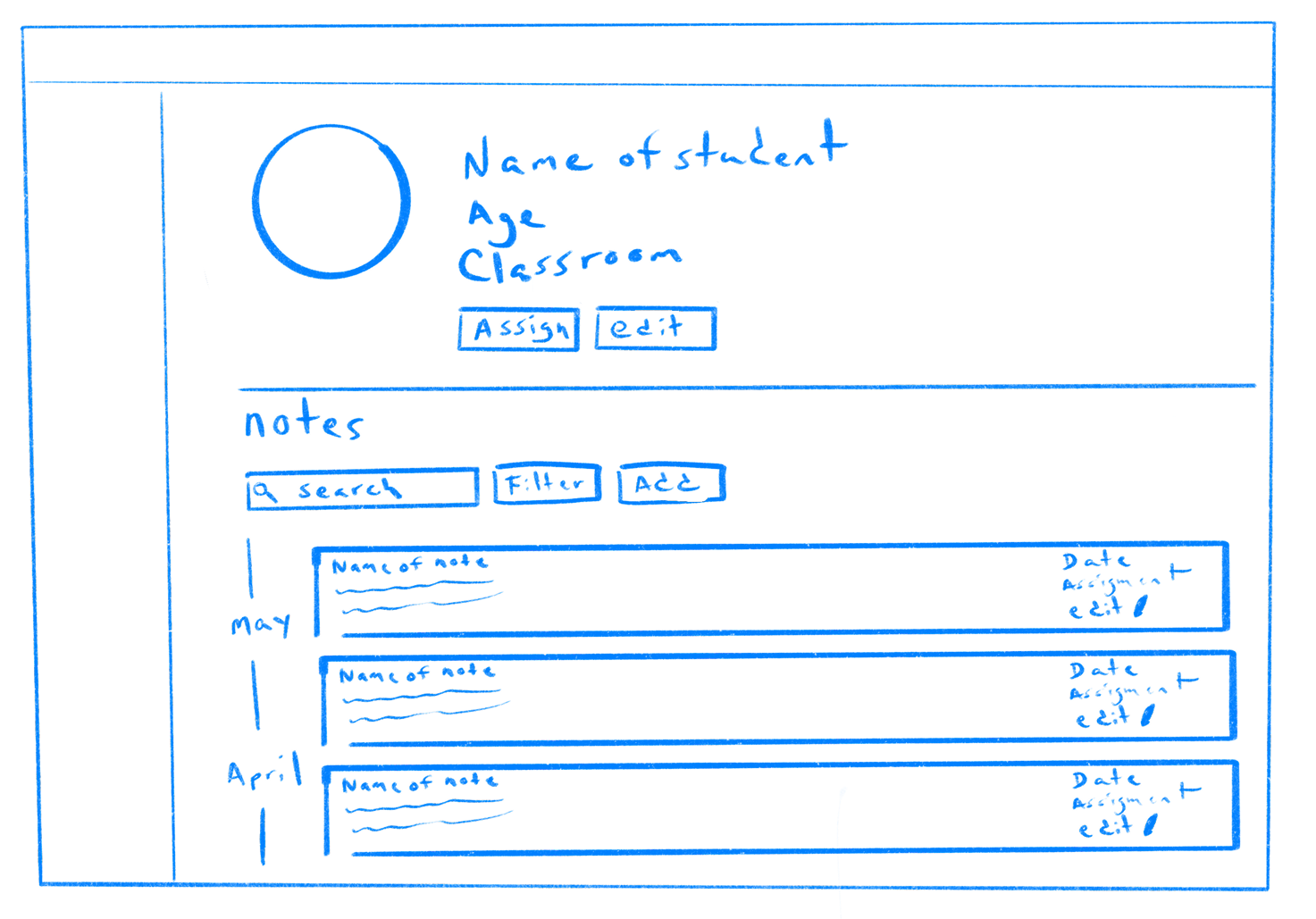
Below are some of the low-fidelity sketches we created, which illustrate our initial ideas and the proposed changes to Evolutio’s app:
We then created the high-fidelity design, addressing most of the issues, considering the time constraints and the upcoming deadline to deliver it to the client. After thorough testing, we finalized the screens and delivered them to the client, who was very pleased with our work.

High Fidelity Design

Learnings

Working on the Evolutio project was an invaluable learning experience for me. It provided me with the opportunity to collaborate closely with a team of designers and engage directly with clients, which was crucial in honing my communication and teamwork skills. I learned how to create intuitive user interfaces that cater to the specific needs of health practitioners and their clients.
The project taught me the importance of balancing user feedback with design best practices, ensuring that the final product is both user-friendly and visually appealing. I also gained insights into the significance of time management and prioritizing features, especially when facing tight deadlines.
Overall, the Evolutio project enhanced my ability to problem-solve creatively, adapt to real-world constraints, and deliver designs that not only meet but exceed client expectations

Related
Work

Check out some of the great projects I've recently done for my glourius clients.