

The Dyslexia Foundation Nigeria is a nonprofit organization working to raise awareness, offer early screenings, and provide support for children with dyslexia across Nigeria. Through a partnership with Tech Fleet, I joined a cross-functional team during Phase 3 of a multi-phase initiative to design a digital learning platform tailored to neurodiverse learners. Our mission: to empower students with dyslexia through accessible learning tools, while equipping teachers and parents with the resources to support their progress — all in a country where access to dyslexia diagnosis and support remains limited.
How might we create a digital learning environment that supports students with dyslexia, while empowering teachers and parents to track and guide progress — all within a fragmented system?
When I joined the Phase 3 team for the Dyslexia Foundation of Nigeria through Tech Fleet, the project had already gone through two development cycles. But instead of building on a strong foundation, we inherited scattered research, incomplete design files, and little knowledge transfer. Many of the contributors from earlier phases didn’t transition into Phase 3, leaving us with unclear user needs and a fragmented vision.
Meanwhile, our users — students with dyslexia, their teachers, and their parents — still lacked a cohesive digital space to learn, teach, and support one another. We were tasked with helping bring this vision to life.
Scattered Knowledge Transfer: The handoff between phases was inconsistent, with most past insights and decisions undocumented or outdated. I took initiative to synthesize research from previous phases, clarify user goals, and work closely with teammates to rebuild a shared understanding of what we were solving for.
Design Inconsistencies Across Teams: The platform was split between two teams — UXDA (student experience) and UXDTB (teacher experience). Working separately meant our design kits diverged significantly, and this issue didn’t come to light until just before a stakeholder meeting. With guidance from Tech Fleet leadership, we quickly aligned visual systems, reworked components, and ensured a consistent experience across both sides of the platform.
Limited Access to Users: Direct research with students and teachers in Nigeria wasn’t possible at this phase. Instead, our research team focused on secondary research, diving deep into the challenges of dyslexia, inclusive learning practices, and accessibility design. This helped us make informed decisions while designing for empathy, simplicity, and support.
Cross-Departmental Coordination: With dedicated research, content, and development teams working asynchronously, I learned to navigate complex team dynamics, proactively communicate across departments, and keep our work on track.
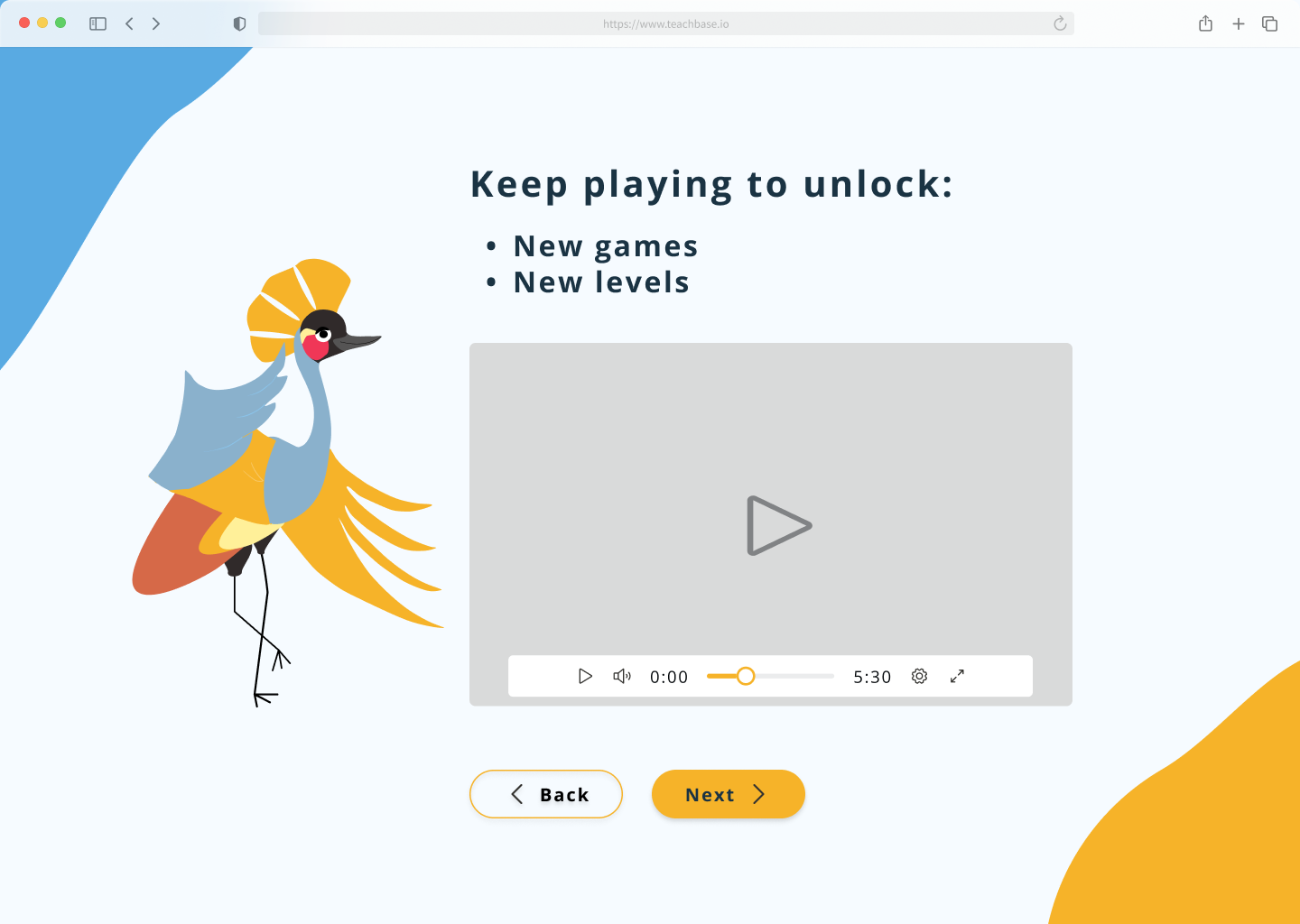
Empower Dyslexic Students
Provide structured, accessible, and engaging learning materials designed to support the unique needs of students with dyslexia.
Support Teacher Workflows
Design tools that help educators track student literacy development, assess learning progress, and adjust instruction effectively.
Engage and Educate Parents
Offer resources and guidance to help parents better understand dyslexia and actively support their child’s educational journey.
Promote Awareness Across Nigeria
Create a unified, inclusive web presence to raise awareness, reduce stigma, and expand access to dyslexia screenings and support.
Lay the Groundwork for Phase 4
Organize and streamline scattered program data to enable future development of features like screening tools, adaptive content delivery, and a parent-facing mobile app — ensuring long-term scalability and impact.
.png)
As the sole UX Designer on this project, I took initiative in an ambiguous, multi-phase environment to craft a user-centered experience for students, teachers, and parents. My contributions included:
Synthesizing legacy research
Reviewed and distilled earlier phase materials to surface relevant insights and align design with user needs.
Mapping multi-user journeys
Outlined end-to-end journeys for students, teachers, and parents to uncover shared frustrations and distinct objectives.
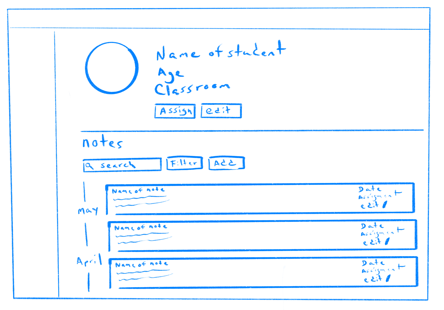
Restructuring platform architecture
Redesigned site navigation to reduce friction, improve accessibility, and streamline content discovery.
Designing for real-world impact
Built low- to high-fidelity wireframes for:
Teacher dashboards to track literacy growth
Student modules designed for dyslexic readers
Parent resources that educate and empowerThrough every step, I kept inclusivity, clarity, and long-term scalability at the core of the design process.
Fragmented research hurts users: Without a central source of truth, earlier design decisions lacked alignment. I helped unify the vision so we could build something coherent and user-first.
One-size doesn’t fit all: Each user group (student, teacher, parent) had unique needs. Designing role-based experiences was essential to avoid overwhelming or confusing anyone.
Accessibility isn’t a feature — it’s the foundation: From color contrast to font selection and navigation hierarchy, every decision was guided by neurodiverse accessibility.
We delivered a scalable design system and platform prototype to hand off for development in future phases. Though the platform hasn’t launched publicly yet, our work laid the foundation for an experience that is inclusive, educational, and empowering.
This project taught me how to bring order to chaos — turning a tangle of information into something simple, helpful, and human-centered.
Working on this project challenged me to lead with empathy, clarity, and structure — especially in a multi-phase, evolving environment. Here's what I took away:
Clarity unlocks momentum
Diving into scattered files and past work taught me the value of organizing chaos into actionable insights — fast.
Designing for accessibility is a mindset, not a checklist
Creating experiences for dyslexic learners deepened my understanding of inclusive design and pushed me to rethink everything from layout to microcopy.
Cross-role journeys require balanced solutions
Designing for students, parents, and teachers at once required constant trade-offs — and taught me how to prioritize user needs across the ecosystem.
Documentation is design, too
Documenting decisions, rationales, and flows became critical in aligning with stakeholders and ensuring continuity across phases.This experience sharpened not only my design thinking but also my ability to lead through ambiguity — a skill I now carry forward into every new project.


To gather the necessary insights for designing effectively, a comprehensive research plan was developed. The main interview questions of the research plan are as follows:
Understanding How Users Interact and Stay Motivated:
User Preferences for Messaging Features:

1. Messaging Friends or Family Post Workout:
.avif)
2. Engaging in Community:
.avif)

Confusion Between Activity and My Progress:
Messaging Feature Placement:
Notification Section Expectations:
Redundant Information Across Sections:
Homepage Focus Suggestion:
%201.avif)
Understanding of the Stories Feature:
Auto Populated Messages:


%201.jpg)
Using a modified GV design sprint process, I focused on rapid ideation, prototyping, and testing over a condensed timeline:

%201.avif)


%201.jpg)


.jpg)
.jpg)


